If you grew up in the 80's here in the UK and were the proud owner of an 8 or 16-bit home computer, there's an excellent chance your eyes regularly glanced upon the splendid artwork of Bob Wakelin, even if you didn't know it at the time. His work was most often found in the form of adverts and cover-art for many of Ocean Software's releases and was among the most iconic and recognisable around.
As many of you may well have heard by now, Bob sadly passed away recently after a long illness. I didn't know him personally but many did as he was active in and very popular with the retro gaming community, and was regularly seen at various retro events. He leaves behind many happy memories for some of us but even those who didn't know him can still appreciate his wonderful artwork which must've surely helped shift a fair few copies of the games it adorned all by itself.
His style was varied and could be found in most games magazines from the mid-to-late 80's as well as on store shelves all over the country and beyond. I love most of his work but, while everyone will have their own favorites, these are in my view his finest efforts which lit up my early gaming years. Rest in peace, Bob...
5. Where Time Stood Still (1988)
This game was notable for being one of the very few 128K-only games for the Speccy which was, to my great pleasure at the time, deemed to be the only 8-bit system that could even manage a version of the game at all. Something else the game was famous for, though, and not just the Speccy version this time, was the splendid artwork that adorned its various covers and magazine adverts. The cynical among you might highlight the flimsily-clothed hottie who stands (almost) centre stage as being the reason for that but the rest of it was fantastic too - the heroic pilot stood next to the blonde stunner, his crashed plane, the scary dinosaurs and angry natives, and that large bold title seemingly carved from ancient rock collectively did an amazing job setting the stage for this epic and memorable adventure.
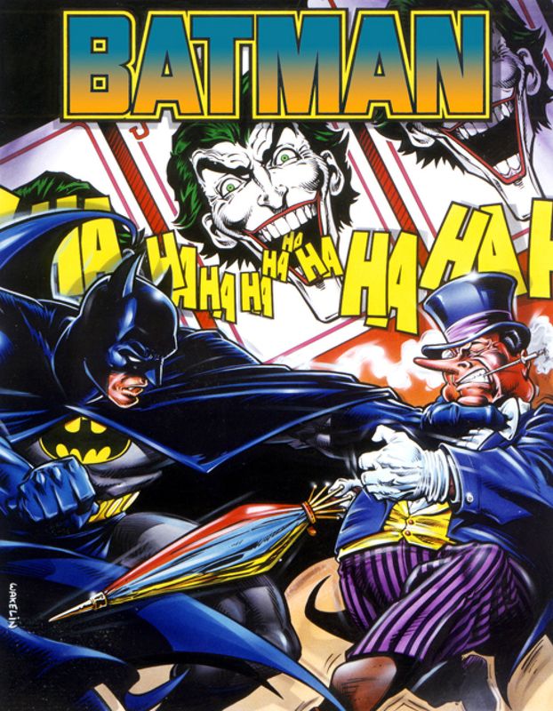
4. Batman (1988)
I've never been that bothered about Batman, either as a character or any of the games in which he starred, and I haven't actually played this particular example a great deal, but just look at the artwork it received. Even I can recognise its outstanding quality and appreciate how much it must've appealed to fans at the time, and indeed still now as well I'm sure. The Caped Crusader himself surely looks as good as he ever did in proper comic-book form as he punches the equally-impressive Penguin right in his stupid throat. The idiotic Joker manages to get in on the action too (more than once in fact), laughing maniacally at... goodness knows. All of them feature in the game too - I really doubt anyone else could've come up with a better ad/cover than this, it's absolutely perfect for the game in question.
3. Wizball (1987)
As one of the most popular games of the era with home micro users, Wizball deserved a top-quality piece of artwork to accompany it on store shelves and it definitely received it thanks to another wonderful example of Mr. Wakelin's talents. Not everything featured thereon would've made a tremendous amount of sense to prospective buyers back in its day but it undoubtedly looked sufficiently intriguing to want to find out. The spacey backdrop along with the unusual scenery and characters conjured all sorts of possibilities in our active imaginations, as did the powerful (and beardy) wizard who was apparently overseeing proceedings. Thankfully the game itself did not disappoint either, being just as creative and unusual as the artwork, making the two of them about as fitting a pair as any you might find in the world of gaming.
2. Rainbow Islands (1987)
It wasn't until the early 90's when I acquired the game for my MegaDrive that I understood the genius of Rainbow Islands but this was still one of my very favourite adverts out of the many that appeared in the glossy pages of C&VG and all my Speccy mags. The title takes up nearly half the page but it could be one of the best of any game ever - a happy colourful rainbow, tropical waters, a desert island and a smiling sun between them, and splendidly chosen fonts. Even a crafty seagull has managed to flap into the shot. Below, we get a superb representation of the game itself with its many islands stretching into the distance with a slightly panicked Bub front and centre pursued by some not-very-lethal-looking bugs. It really is a wonderful piece of artwork which is more than good enough for one of the all-time great games.
1. The New Zealand Story (1988)
As impressive and endearing as his Rainbow Islands effort is though, my favourite of all Mr. Wakelin's pieces personally must be this stunning example for another Taito arcade conversion. The game is another of my all-time faves and stars the brave Tiki the Kiwi as he battles through all manner of terrifying creatures to save his brethren from the clutches of the evil Wally Walrus, but the reason I even played the game to start with was entirely down to this gorgeous advert which captures the spirit of the great game perfectly. It's a challenging adventure and poor Tiki really does have it all against him, just as is superbly depicted here (not sure why the little cat thing is running away though!). I really do love this piece - not only is it my favourite of Bob's many superb examples but it may well be my favourite piece of game art from
any artist...
Honourable mentions: Head Over Heels, Renegade, Rastan, Cabal, Beach Volley, Chase HQ, Pang, Vindicator, Parallax, Athena... the list goes on!


No comments:
Post a Comment